Blog
Controls - How to use the Tab List control - Examples
April 3. 2023
Do you want to use the new Power Apps Tab List control but don't know how? If so, this post provides some practical examples of how to use this new control.
Microsoft has recently released in preview, its new set of modern/Fluent controls for canvas apps.
A new control in this suite is the Tab List control. This control renders a data source as a clickable list of tab items. Its purpose is to help build the header for a tab layout.
As a newly released control, the documentation is very sparse.
Therefore, this post provides some practical, working examples of how to use this control.
Note that as a prerequisite, it's necessary to enable the 'Try out the modern controls' option in the settings of the app.
How to display a list of hard-coded values in the Tab List control
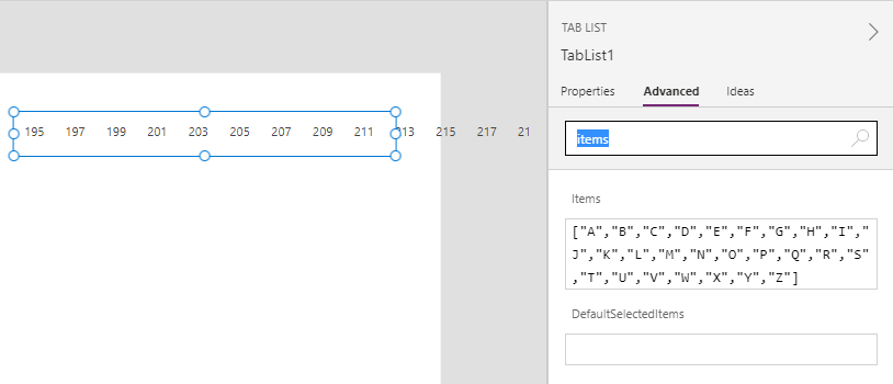
To begin, let's look at how to display a list of hardcoded values in the Tab List control. To demonstrate, we'll use it to display the letters A to Z.The first step is to drag a Tab List control onto the screen and to set the Items property to the following.
.
["A","B","C","D","E","F","G","H","I","J","K","L","M","N","O","P","Q","R","S","T","U","V","W","X","Y","Z"]
At this stage, the designer shows a bizarre set of numbers.
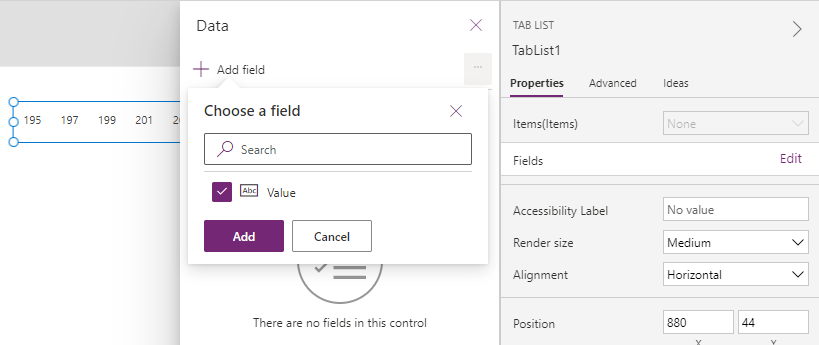
This is because it's necessary to set the Fields property for the control. To do this, we click the Fields > Edit link and select 'Value' from the 'Choose a field' section . Once we do this, the Tab list control will correctly display the letters A-Z.
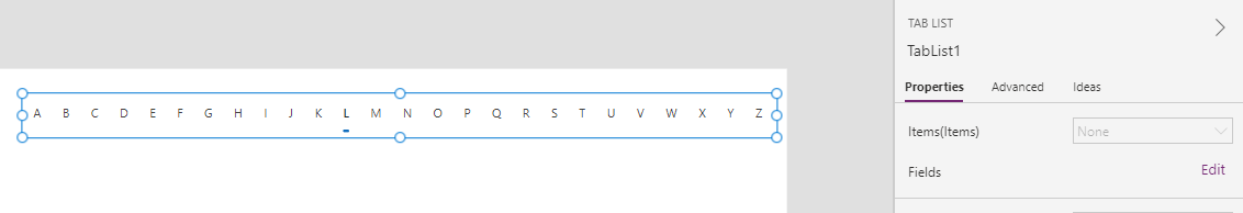
If we now run our app, we can click a tab item. Once selected, the item will be underlined with a bold blue line.
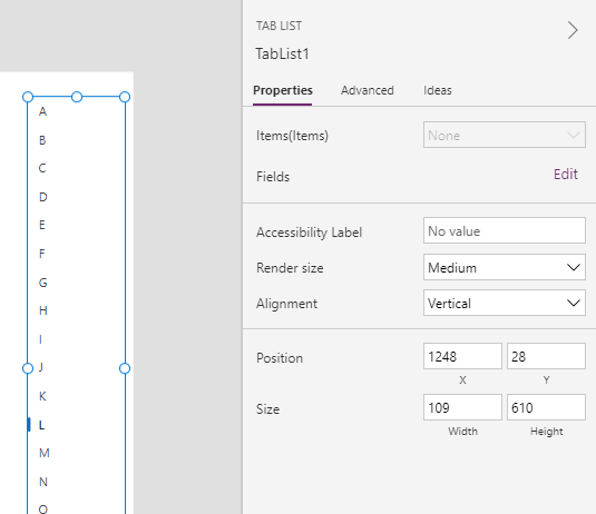
Changing the alignment of the Tab List control
In practice, a useful property of the tab list control is the Alignment property. We can use this to change the arrangement of the tab items from horizontal to vertical, as shown in the screenshot beneath.
.
How to retrieve the selected Tab List item
Like the gallery control, the tab list control exposes a property called 'Selected'. We can use this to retrieve the selected item in the tab list.
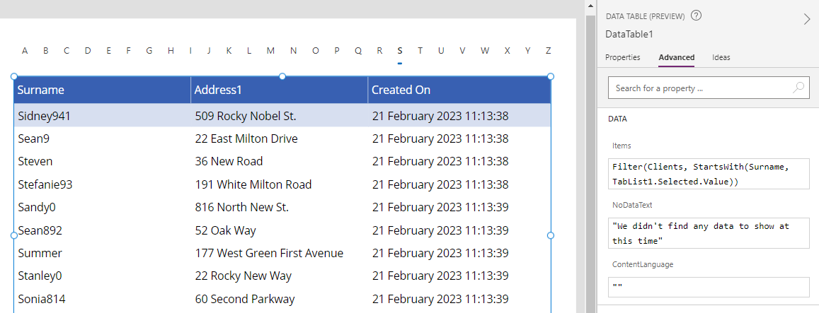
To demonstrate a typical use case, we'll add a data table control that displays a filtered list of client records that begin with the selected letter.
To do this, we add a data table control to our screen and set the Items property as follows.
Filter(Clients, StartsWith(Surname, TabList.Selected.Value))
At this point, the data table control will show only those customers where the surname begins with the selected letter.
How to navigate screens with the Tab List control
As the documentation states, we can use the tab list control to "move between screens".
This can be very useful if we were building a navigation component in our app.
To implement this type of functionality, we would add a Tab List control and set the Items property to the following.
To implement this type of functionality, we would add a Tab List control and set the Items property to the following.
[
  {Desc:"Screen One",Screen:Screen1},
  {Desc:"Screen Two",Screen:Screen2},
  {Desc:"Screen Three",Screen:Screen3}
]
This formula defines an array with a set of records that contain "Desc" and "Screen" fields. The "Screen" field defines the target screen of the
navigation.
Through the Fields>Edit link in the properties, we add the "Desc" field. We then set the OnSelect property of the control to the following formula
Through the Fields>Edit link in the properties, we add the "Desc" field. We then set the OnSelect property of the control to the following formula
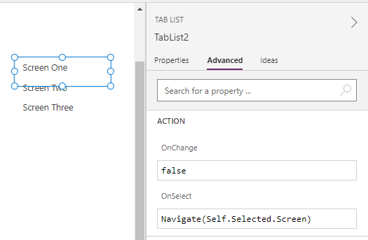
We can now run our app and click the tab items to navigate to a target screen.
How to use the Tab List control to select records
We can populate the Tab List control with data from a data source. An example of this is to use the Tab List to select records.As an example, we can add a Tab List control and use it to display Client records by setting the Items property to the Clients table.
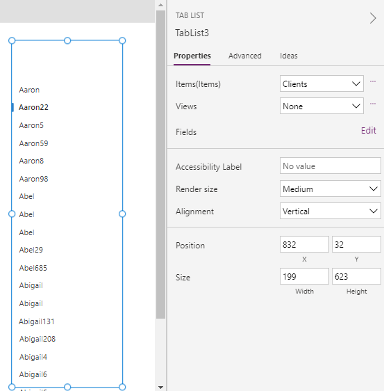
Next, we can add a Form control and set the DataSource property to Clients, and the Item property to TabList3.Selected.
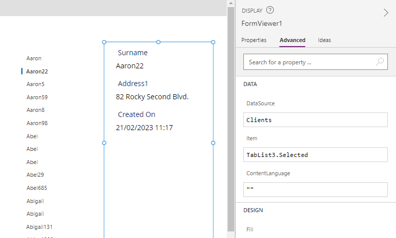
At run time, the user can now use the Tab List control to select a client and to display the full details in the Form that's adjacent to the Tab List control.
Conclusion
The Tab List control is a new modern control that is currently in preview. This post provided some examples of how to configure and use this control.
- Categories:
- controls
Related posts
- Controls - How to build a control to enter measurements in inches with fractional units
- Controls - How to build a component for users to enter numbers with a set of connected slider and text input controls
- Controls - How to set height of nested galleries dynmically
- Barcodes - How to scan barcodes - a summary of the 3 available barcode scanning controls
- Controls - How to create multi-line tooltips or multi-line text input control hint text
- Controls - How to add a clickable image / image button
- Controls - Restrict text input control to whole numbers only
- Controls - How to submit a form (or to run formula) when a user presses enter/return on the keyboard
- Controls - How to create rounded labels - workaround
- Controls - How to enter and display Office/Microsoft 365 email addresses with a combo box
- Gallery control - How to set no selected item in a gallery
- Model Driven App - How to apply an input mask to a text input field
- Controls - How to reset or clear data entry controls, and form values
- Controls - How to Transition/Show/Hide controls with a Sliding Effect
- Gallery Control - How to Paginate Data